ShopDreamUp AI ArtDreamUp

Deviation Actions


![The Flier [CLOSED]](https://images-wixmp-ed30a86b8c4ca887773594c2.wixmp.com/f/0c12ce18-e415-4a9b-8eec-a04792999377/d6bjbl0-7dcd0fe0-e5cb-4b1b-a923-9ca5f4491605.jpg/v1/crop/w_92,h_92,x_9,y_0,scl_0.039032668646585,q_70,strp/the_flier__closed__by_virensere_d6bjbl0-92s.jpg?token=eyJ0eXAiOiJKV1QiLCJhbGciOiJIUzI1NiJ9.eyJzdWIiOiJ1cm46YXBwOjdlMGQxODg5ODIyNjQzNzNhNWYwZDQxNWVhMGQyNmUwIiwiaXNzIjoidXJuOmFwcDo3ZTBkMTg4OTgyMjY0MzczYTVmMGQ0MTVlYTBkMjZlMCIsIm9iaiI6W1t7ImhlaWdodCI6Ijw9OTE0IiwicGF0aCI6IlwvZlwvMGMxMmNlMTgtZTQxNS00YTliLThlZWMtYTA0NzkyOTk5Mzc3XC9kNmJqYmwwLTdkY2QwZmUwLWU1Y2ItNGIxYi1hOTIzLTljYTVmNDQ5MTYwNS5qcGciLCJ3aWR0aCI6Ijw9MTI4MCJ9XV0sImF1ZCI6WyJ1cm46c2VydmljZTppbWFnZS5vcGVyYXRpb25zIl19.GZN739t9gjYhdeQiaGktqLRcLXk_mZAOLFn2ojO3qfY)


Suggested Deviants


Suggested Collections


You Might Like…


Featured in Groups


Description
I woould like to say one thing.... JUST IN TIME! AMG! Okay sorry, i got all excited there.
But oh wow, where to start.
This is my part of the August exchange in the group For
For 
First of all i'd like to say, that i never thought the background would come out so good. For me atleast. I'm actually kinda proud of myself with the bg. (That's a rare sight, eh?) I really like how i did the bark n stuff. Though i failed the little river thingy, but ya know, you live and learn.
But i guess i got cought up so much with the bg that i failed at the character. I am really dissapointed at this part. I failed the anatomy, pose, shading. Basically everyhing. (except the disfigured hand. I like dat one.) So i'm really sorry for concentrating more on the bg than the chara itself. v.v
This took so much time, and the closer i got to finishing it the more frustrated i became. :I
I really hope you like it *SoronaDragon And i'm sorry for failing so hard. :c
Though i really like the character, really interesting concept!
P.s. there are the numbers on the horn, they are just hard to see. I know. I'm a derp.
Critiques are welcomed open handedly! I really appreciate every feedback i get! <3
Art (c) A.k.a. MEEE
Damaris (c)
But oh wow, where to start.
This is my part of the August exchange in the group
For First of all i'd like to say, that i never thought the background would come out so good. For me atleast. I'm actually kinda proud of myself with the bg. (That's a rare sight, eh?) I really like how i did the bark n stuff. Though i failed the little river thingy, but ya know, you live and learn.
But i guess i got cought up so much with the bg that i failed at the character. I am really dissapointed at this part. I failed the anatomy, pose, shading. Basically everyhing. (except the disfigured hand. I like dat one.) So i'm really sorry for concentrating more on the bg than the chara itself. v.v
This took so much time, and the closer i got to finishing it the more frustrated i became. :I
I really hope you like it *SoronaDragon And i'm sorry for failing so hard. :c
Though i really like the character, really interesting concept!
P.s. there are the numbers on the horn, they are just hard to see. I know. I'm a derp.
Critiques are welcomed open handedly! I really appreciate every feedback i get! <3
Art (c)
A.k.a. MEEEDamaris (c)
Image size
4961x3508px 13.03 MB
© 2013 - 2024 Virensere
Comments26
Join the community to add your comment. Already a deviant? Log In
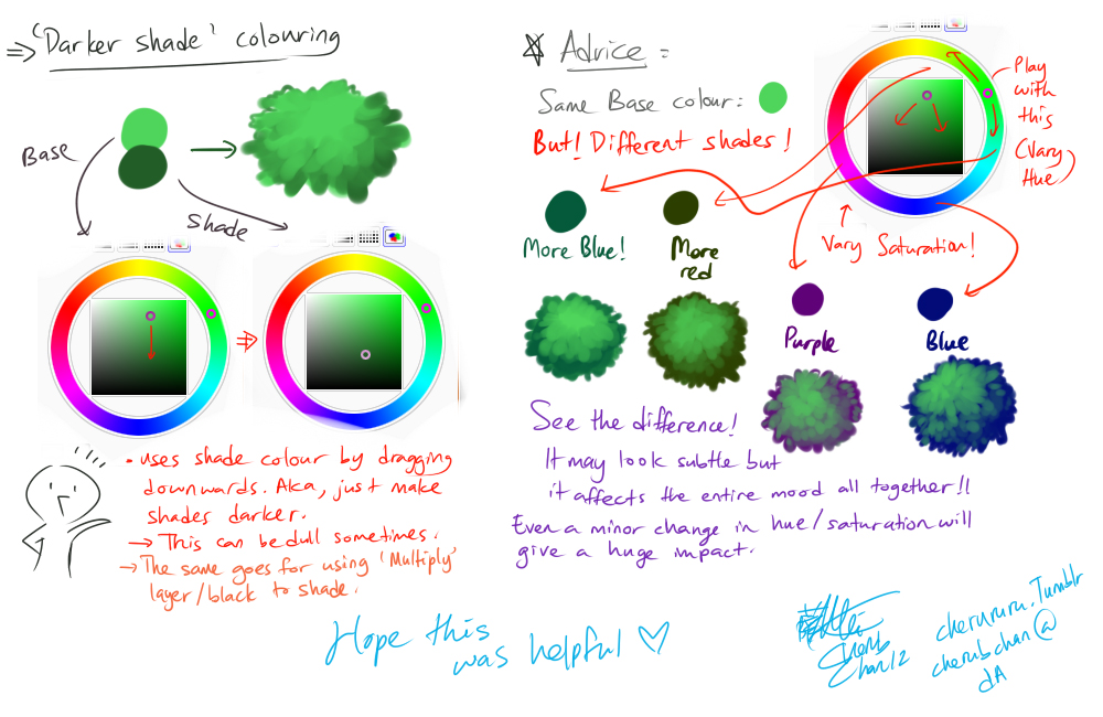
if you're still taking critiques, I'd like to put in a word of advice, friend :>
I'd recommend using a bit more contrast and different colours; it seems like you used only darker and lighter shades of the same red. It's a lot more appealing to the eye to use multiple colours, like cool shadows (blue, green, etc.) and warm highlights (yellow, orange, etc.) or vice versa, and would make him pop out a bit more.
there's a great tutorial thing here and here on colour that are super useful. uwu
I'd also make his paws a little bigger so they could better support his weight, but that might just be me. c:
PS I love how you did the light streaming down!